Radhika Ventures is a real estate company in South India.
the brief
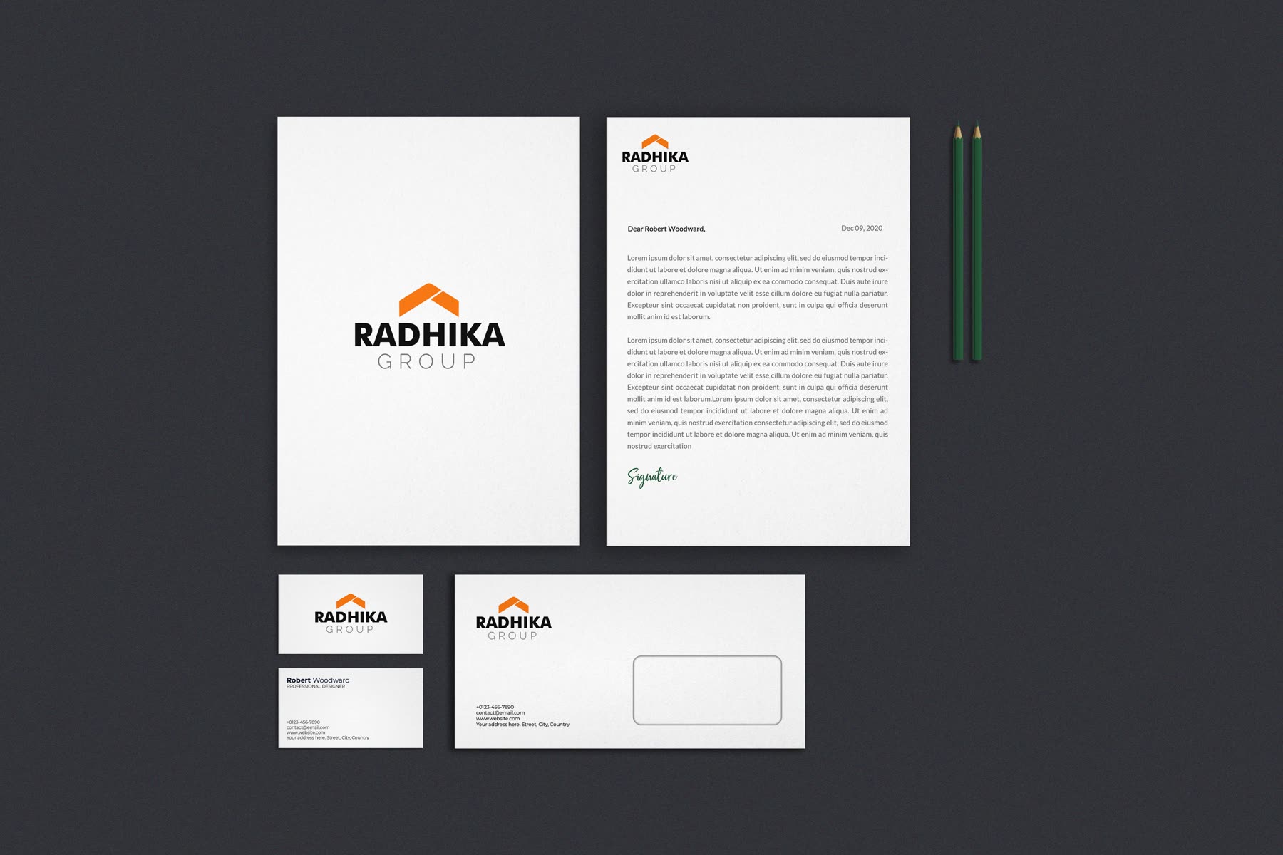
Radhika Ventures is a real estate company in South India. They wanted a logo and full branding, delivered as a system they could hand to a printer or a sign-maker without needing me in the room.
So the deliverable was not just a mark but the guidelines around it.
the tricky bit
The deliverable was not a logo. It was a logo that could be handed to a printer or a sign-maker in another town, without the designer in the room, and still come back right.
Real estate is also where marks get abused hardest — stretched onto hoardings, embroidered onto shirts, reproduced from a WhatsApp forward.
what I did
A system rather than a file. Clear space, minimum sizes, approved colourways, and what happens on a dark background — the rules that decide whether a brand survives its third vendor.
The guidelines are written for the person actually holding the job, not for a design team. That is what "hand it over" has to mean when there is no design team on the other end.