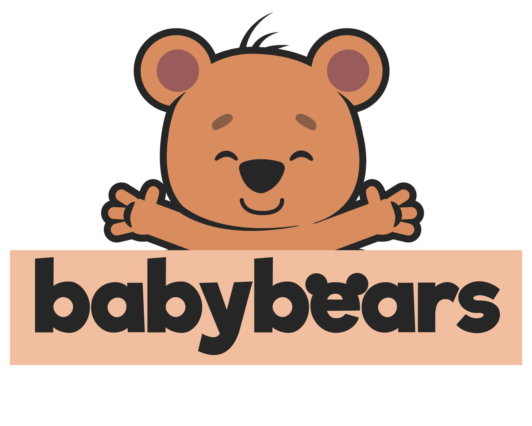
A logo for a kids' apparel and toy e-commerce brand — plus the type and colour system built around it for this portfolio.
the brief
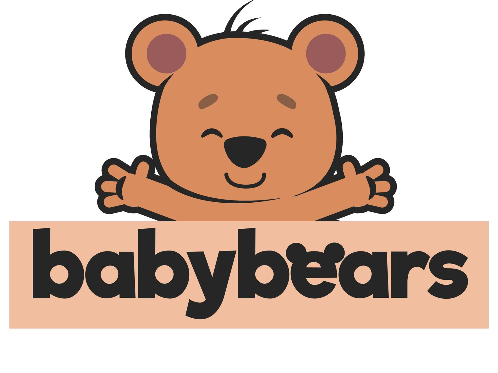
Baby Bears sells children's clothing and toys online. The original commission was the logo only: a bear mascot and the wordmark it holds.
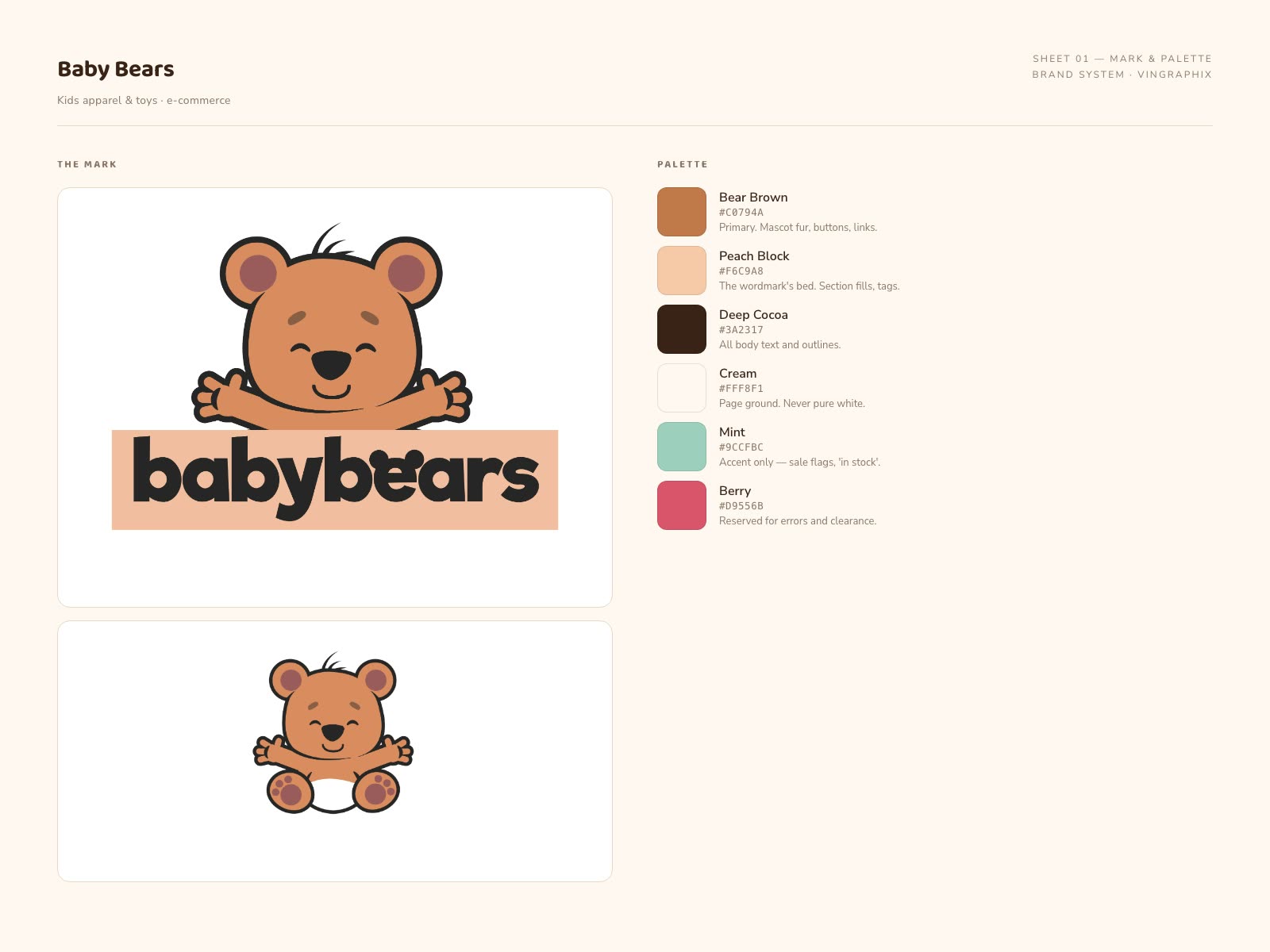
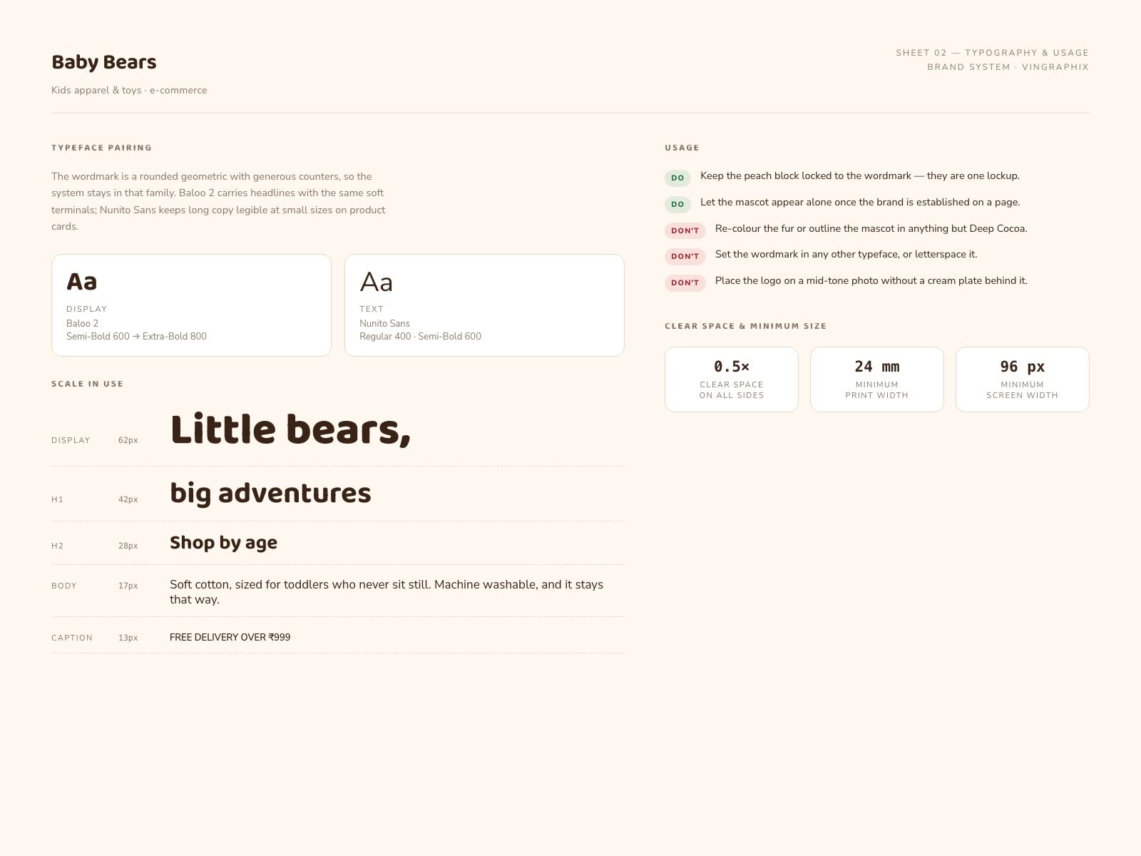
No type or colour specification survived from the project, so the system shown here — typefaces, palette, usage rules and applications — was authored for this portfolio to show how the mark extends into a working brand.
the tricky bit
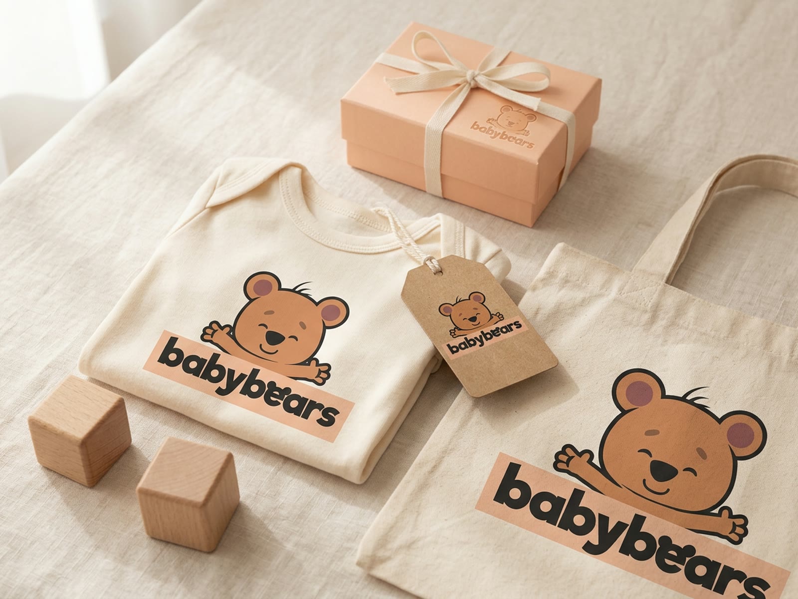
A children's mascot has about a second to be liked, and it has to survive being embroidered onto a onesie, printed on a swing tag and shrunk to a favicon.
Most kids' logos get there with detail — big eyes, lots of little shapes — and then fall apart at small sizes.
what I did
The mascot is built from a small number of rounded shapes with a single heavy outline, so it holds together at 16 pixels or on a tote bag. The arms reach around the wordmark, which locks the two into one piece rather than a logo sitting above a name.
For the system: Baloo 2 for headlines because it shares the wordmark's soft terminals, Nunito Sans for anything long. Bear brown and peach carry the brand; mint and berry are held back for stock and sale states only.