"A small coffee shop in Europe wanted an emblem rather than a wordmark — something they could use in a lot of places, packaging included."
A small coffee shop in Europe wanted an emblem rather than a wordmark — something they could use in a lot of places, packaging included.
the brief
A small coffee shop in Europe wanted an emblem rather than a wordmark — something they could use in a lot of places, packaging included.
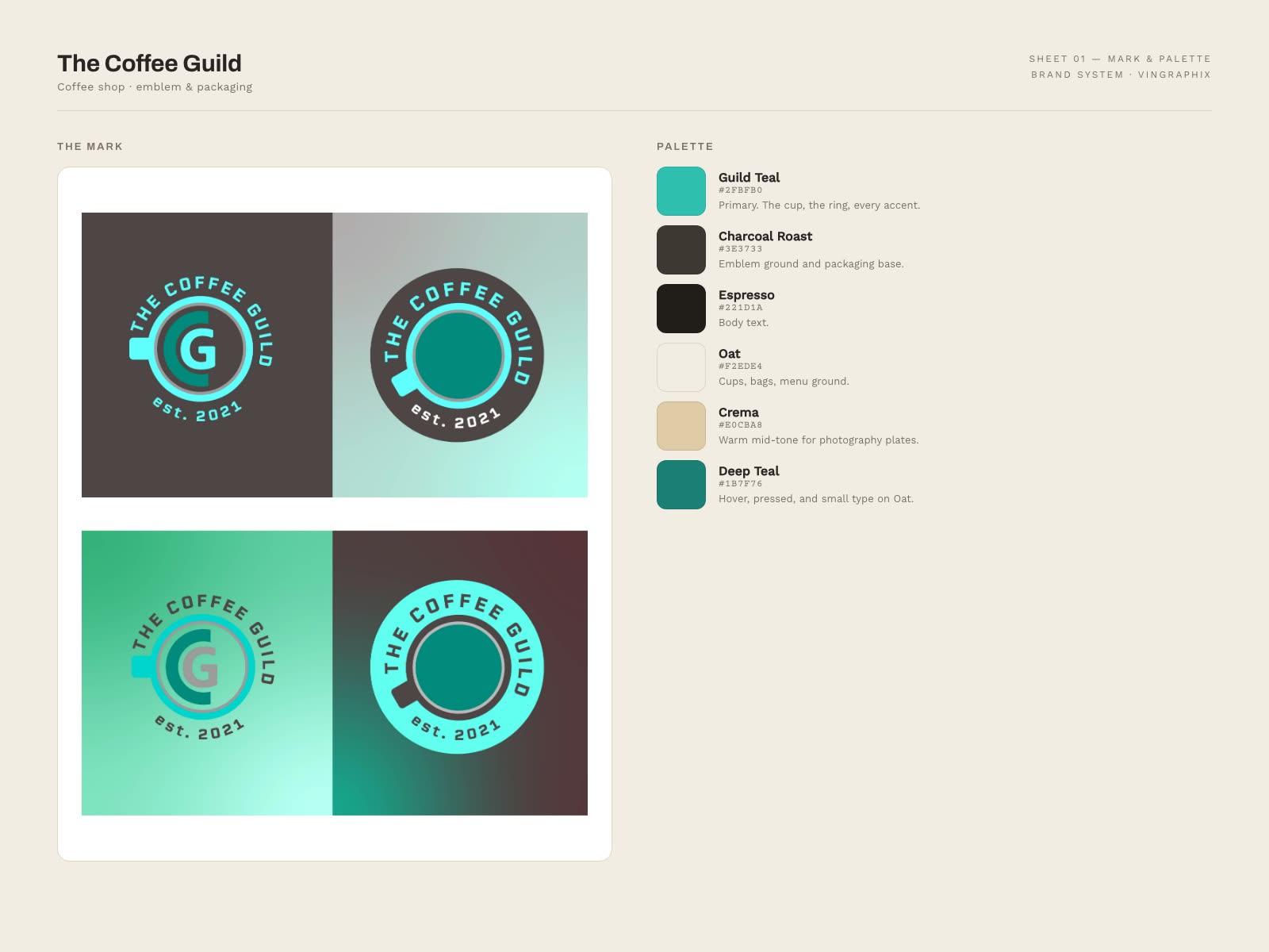
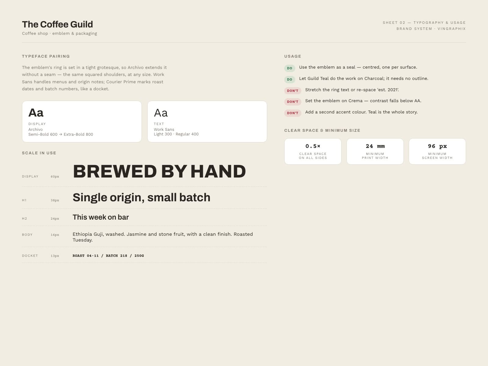
The emblem was the commission. The palette, typefaces and usage rules here were authored for this portfolio to show the system it belongs to.
the tricky bit
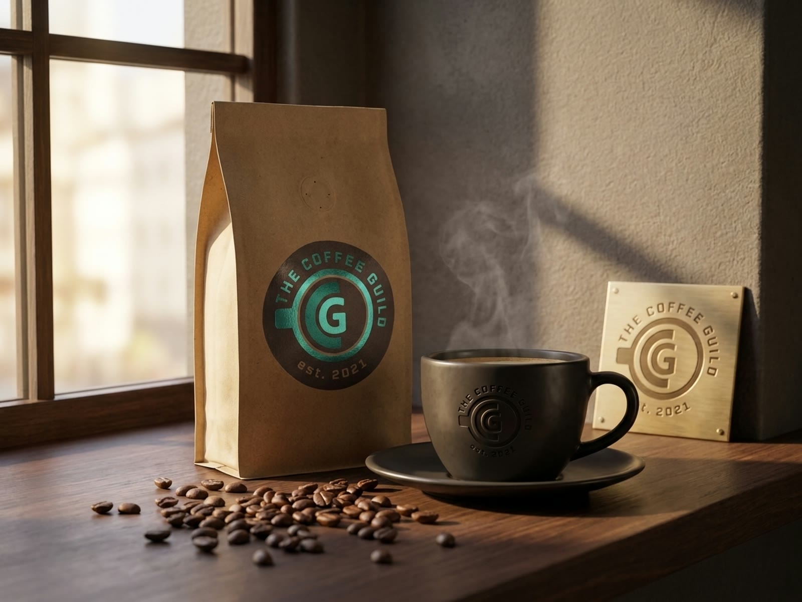
They asked for an emblem, not a wordmark — something that would work on a cup, a bag, a window and a stamp. An emblem has to survive being small, single-colour and printed on brown card.
Coffee is also the most crowded emblem category there is. Every trope — the bean, the cup, the laurel — is taken.
what I did
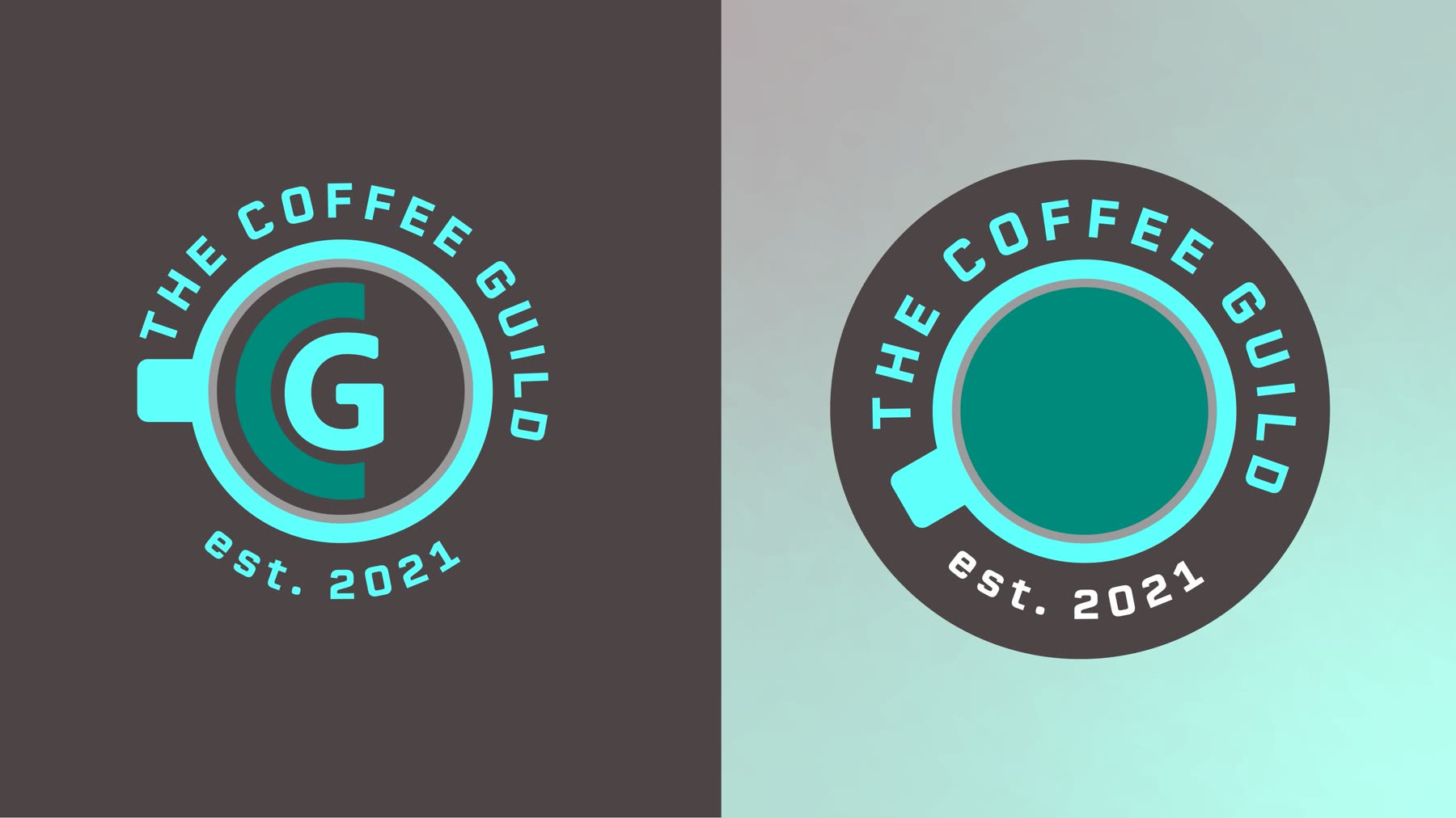
A closed emblem with a defined outer shape, so it reads as a seal at any size and can be stamped, embroidered or foiled without redrawing.
Built as a single-weight line drawing that holds at a centimetre across, because the smallest application is a cup, not a shopfront.
The palette, typefaces and usage rules here were authored for this portfolio to show the system the emblem belongs to — the emblem itself was the commission, and the page says so.