Laura Emili hand-pours premium scented candles in small batches.
the brief
Laura Emili hand-pours premium scented candles in small batches. The brief was packaging: the box, the jar label and the surrounding collateral.
A candle is bought as a gift more often than for oneself, so the box matters as much as the wax.
the tricky bit
A candle is bought as a gift more often than for oneself, so the box carries as much of the decision as the wax. It has to look like something you would hand to someone without apologising.
And it is a range. Every scent needs its own identity while the shelf still reads as one brand.
what I did
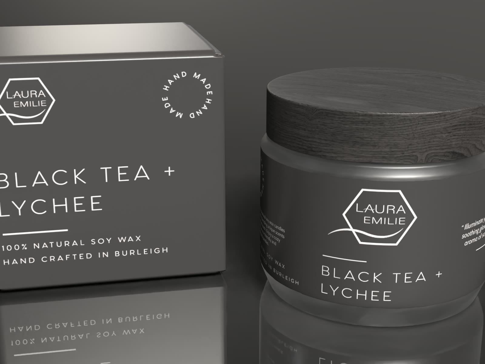
Charcoal and white, everything in fine line work. A hexagon holding the wordmark with a single curved rule beneath it — a mark quiet enough to sit on a jar without competing with the wax.
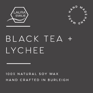
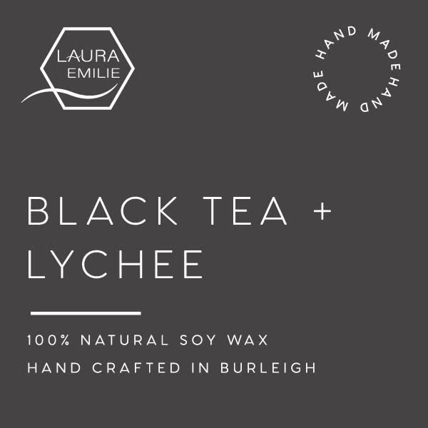
The system's move is that only the scent name changes. Black Tea + Lychee is set in wide, light capitals with a rule under it and the same two lines beneath — 100% natural soy wax, hand crafted in Burleigh. Swap the words and the next variant already exists.
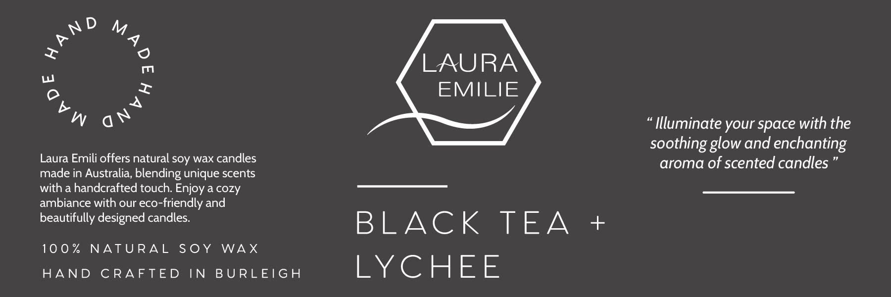
The jar wears the same label as the box, so the object left on a shelf after the packaging is gone still carries the brand.