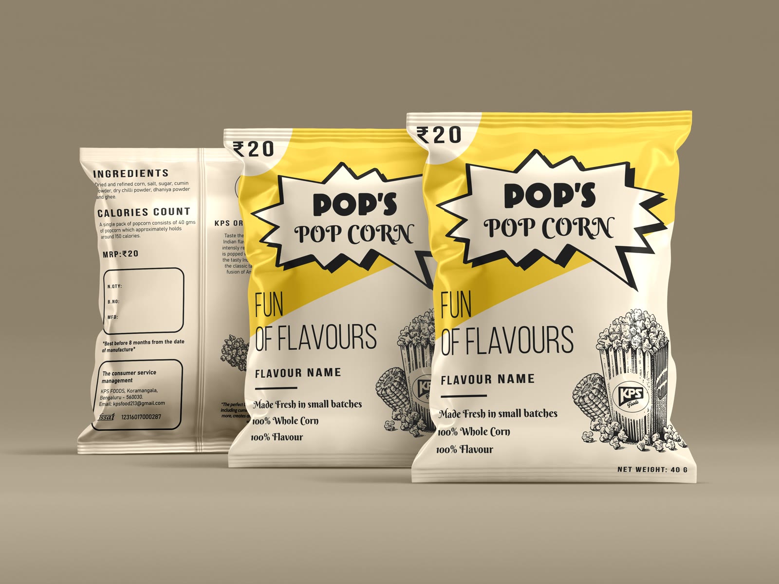
KPS Foods needed packaging for a popcorn brand priced at ₹20 a packet.
the brief
KPS Foods needed packaging for a popcorn brand priced at ₹20 a packet. Branding, packaging, the lot — on a budget that matched the price point.
When the product costs twenty rupees, the packaging has to earn its place in a fraction of a second and cost almost nothing to print.
the tricky bit
At twenty rupees a packet, the packaging has two jobs and almost no budget for either: earn a glance in a fraction of a second, and cost almost nothing to print.
That rules out most of the toolkit. No special finishes, no high colour count, no large flat areas of expensive ink.
what I did
A limited palette carried by one loud brand block, so recognition comes from colour and shape rather than from anything that costs money to reproduce.
The product name is sized to be read from across a shop, and everything else is subordinate to it. On a packet this cheap, hierarchy is the whole design — there is no second look to earn.