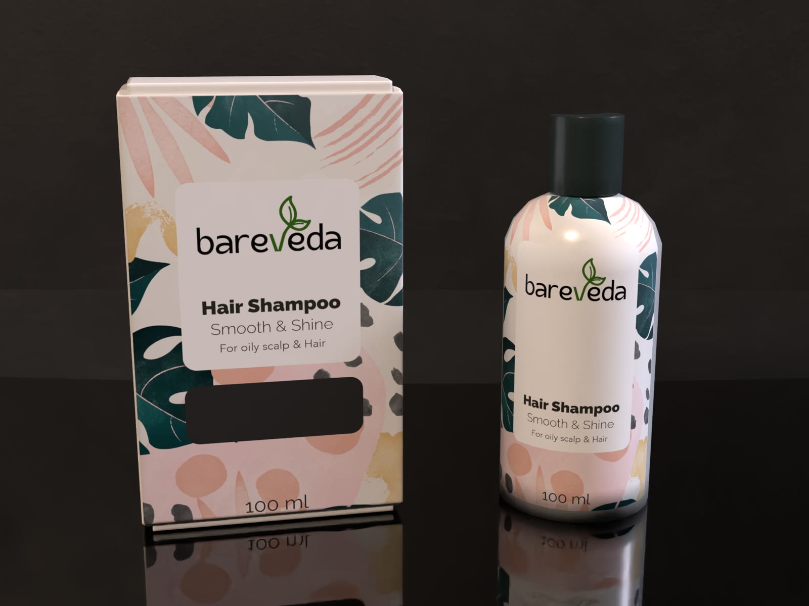
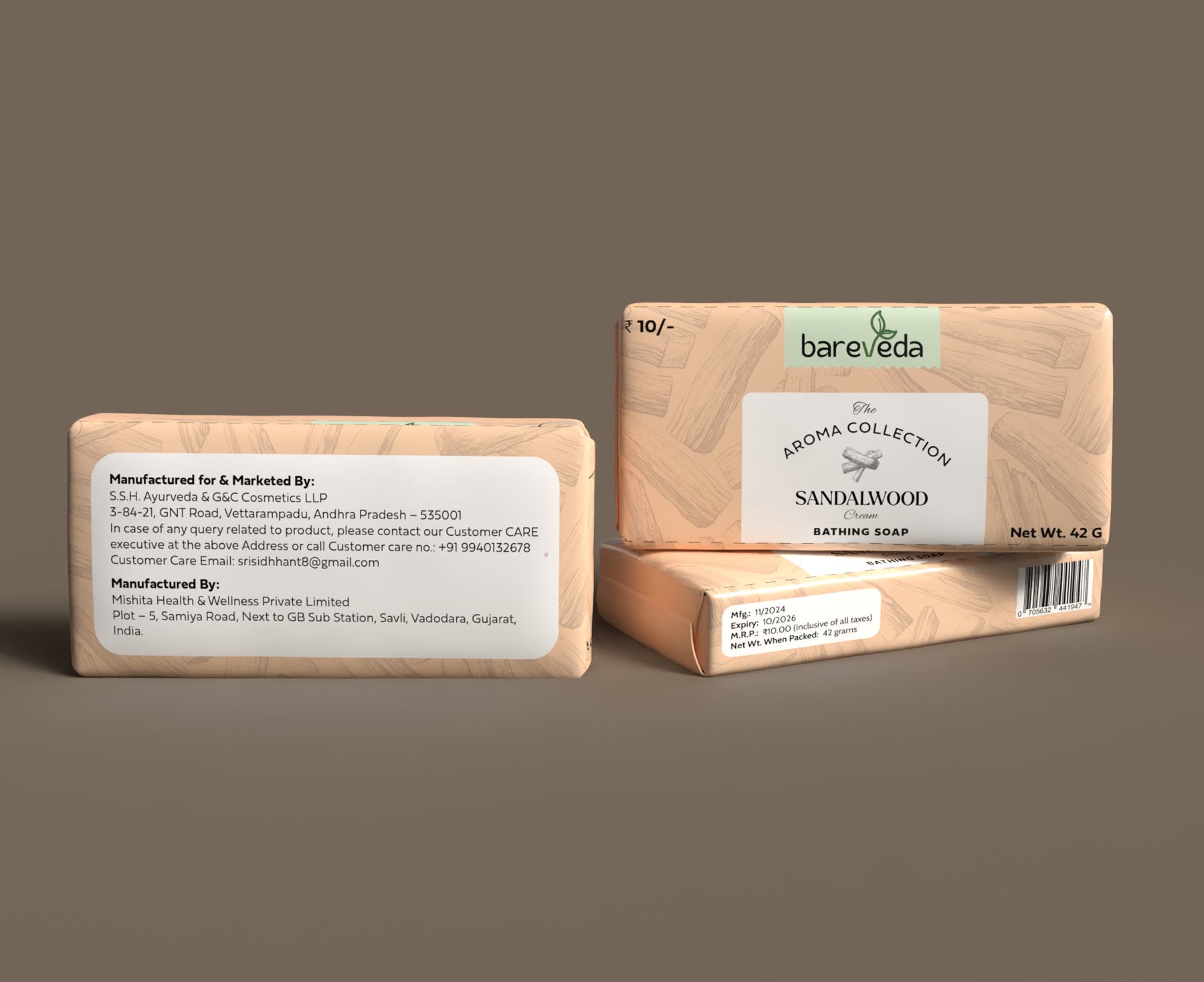
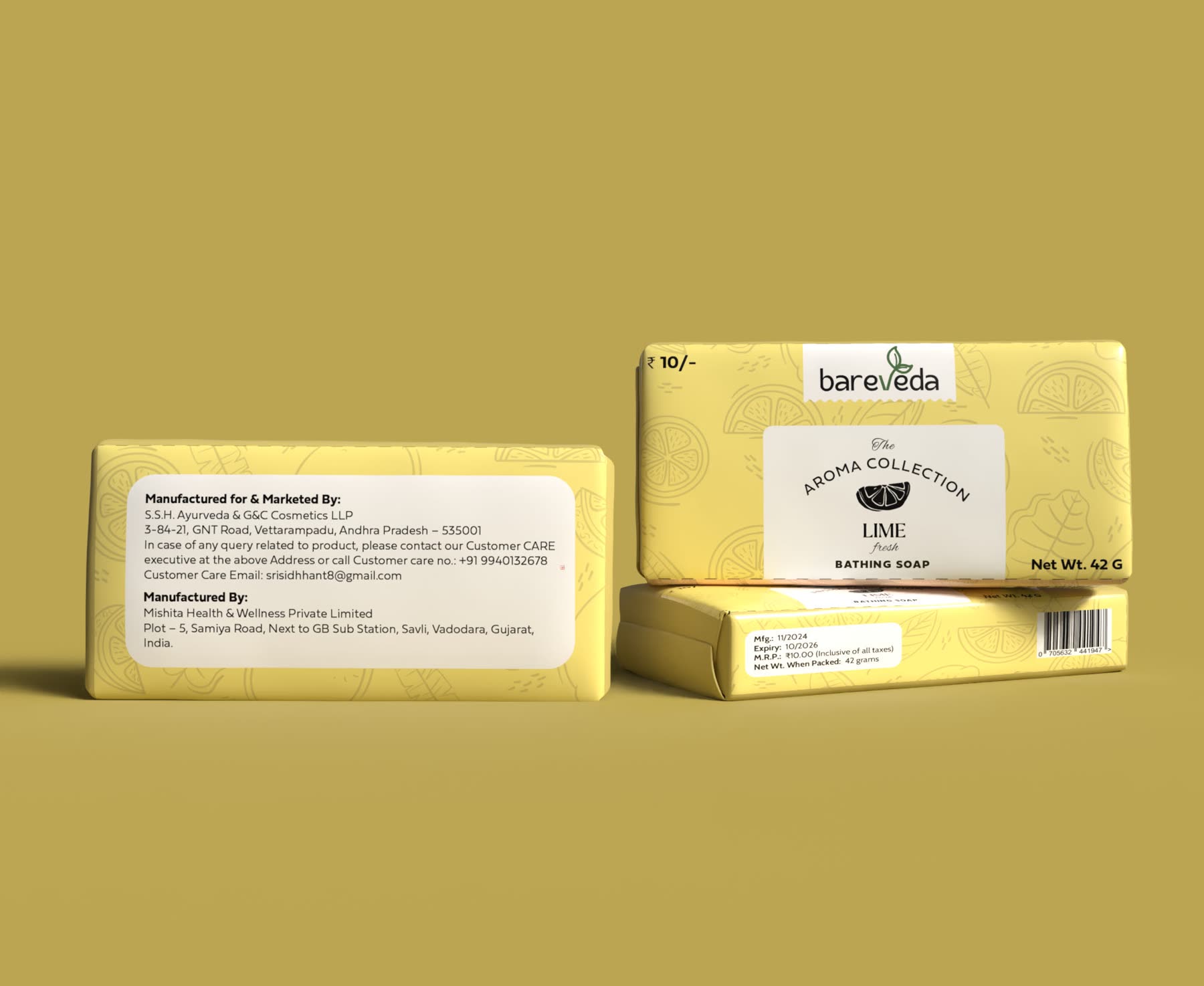
Bareveda is an affordable shampoo and soap brand.
the brief
Bareveda is an affordable shampoo and soap brand. The brief was packaging for a range: multiple shampoo variants and a set of aroma soaps, all of which had to look like they belonged to each other.
Affordable is the constraint, not the aesthetic.
the tricky bit
Affordable is the constraint, not the aesthetic. A shampoo range at this price cannot buy finishes, foils or a fifth colour — and it still has to sit next to brands that can.
The range problem is sharper than the single-pack problem: several shampoo variants and a set of aroma soaps that must read as one family from two metres away, while staying distinguishable at arm's length.
what I did
One fixed layout across the range — logo, product name and variant always in the same place — so the family reads as a block on shelf. Only the colour changes between variants.
Holding the structure constant is what buys the range its shelf presence. It is the cheapest way to look deliberate, and it costs nothing per pack to print.